

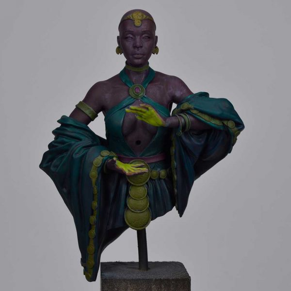
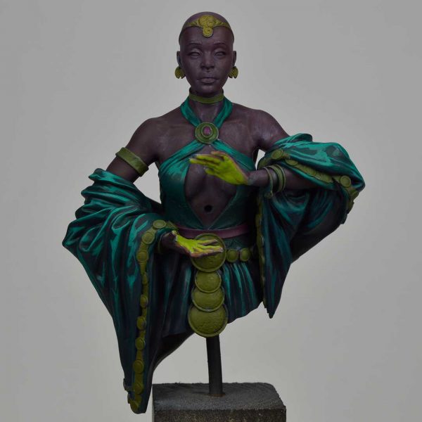
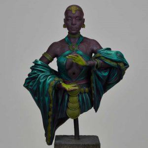
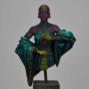
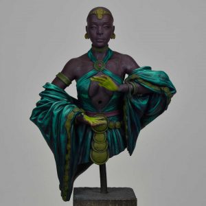
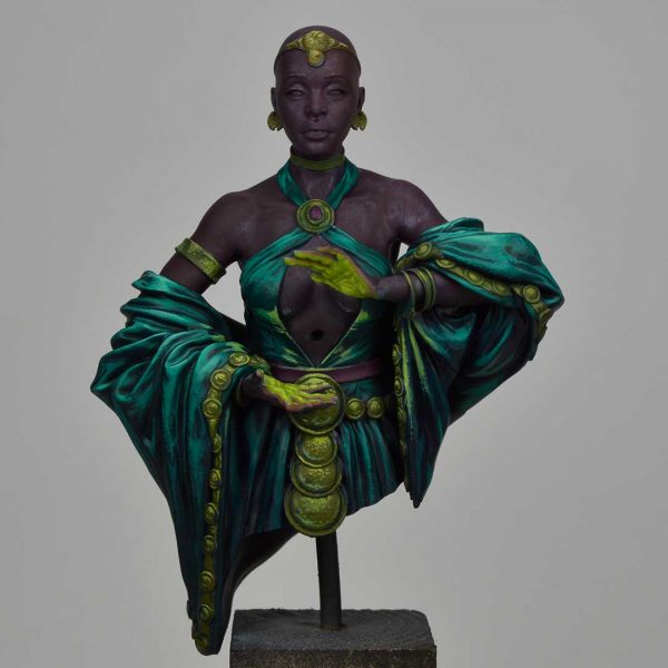
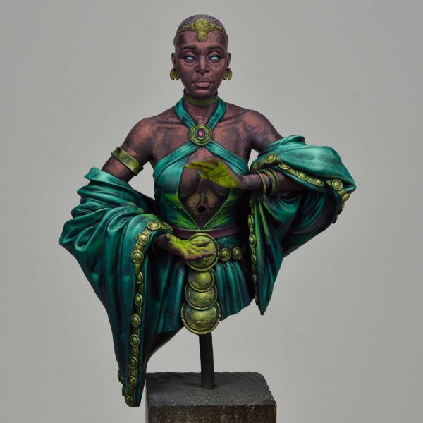
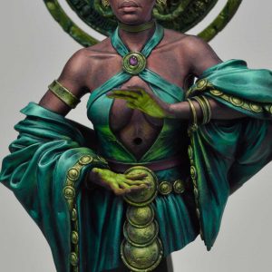
INTRODUCTION
When I was proposed this project by the Big Child team and received the concept of the figure, I thought it was an incredible character to work with effects and ideas that are a challenge for any miniature painter. The skin of the priestess, the silky fabric, the golds and especially the light effect from the ball are a very complete and complex work combo that I decided to plan very carefully so I wouldn’t have to improvise during the process and could go directly to the objective. Even so, no matter how much one plans, situations always arise during a creative process, either because things do not go as expected or because of a matter of inspiration, which makes us take other more interesting paths that had not been contemplated at the beginning. Anyway, I think the result of the piece is more than satisfactory and I hope that this tutorial will be a proof of the work behind the figure, and that it will be instructive and inspiring for those who dare to paint this magnificent figure.
MAIN COLORS
The colors I used to paint the figure are:
KIMERA
Violet, Pthalo Green, Red oxide, Magenta, Kiwi Brown.
Model Color
Cool White, Black
Liquitex Inks
Chestnut ink, Purple ink.
Aero Color
Primary Yellow, Magenta, Blue
Golden Acrylic
Pthalo Green, Phtalo Blue, Diarylide Yellow, Permanent Violet Dark
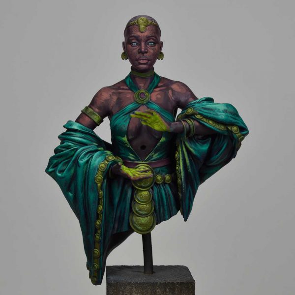
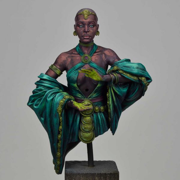
I always try to keep the initial color palette quite limited, in order to maintain a certain general atmosphere. In this case I approached it by playing mainly with the dualism between turquoise green and magenta. The color scheme would consist of three levels, on one side the skin (reddish brown), the fabric (green), and the golden medallions (yellow). The effect of the orb would have a strength of slightly greenish yellow, with a very high light value seeking to represent the light emanating from it. In any case, at the beginning I have some colors that we could consider as basic, those that for me will be the primary ones, which I will test to start the piece. Later I will add others, according to their properties and the effect I will need, but they will be small “cameos”
BASE COATINGS
The first step was to prime in black and then mark some white highlights with the airbrush. This part of the process is practically a ritual but it really works fantastic for me to discover the general volumetry of the figure and to establish a clear base to work the colors on.

I proposed the base layers of green with a mixture of phtalo green, violet and blue in different proportions depending on the deeper areas. The idea is to give some variety to the green to break the homogeneity and enrich the material.
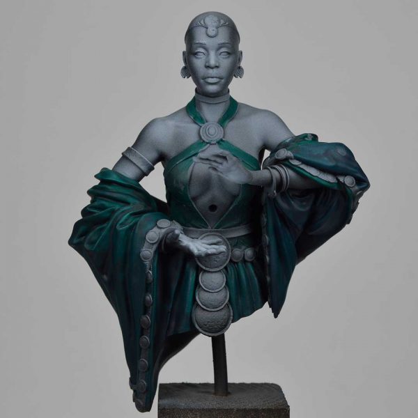
For the base of the gold borders I mixed yellow, green and red oxide, to give it an orange touch. I added a touch of Golden´s yellow to give more warmth. It is important to control the saturation of the base so that it doesn’t go out of the scheme and the relatively dark environment, but above all so that it doesn’t look too cartoonish. Also, the light areas usually have more color power so it is better to reserve those strokes for that part of the process.
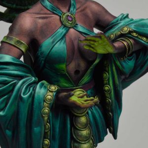
Painting a black skin is not easy but I think that one of the points that can help is to start from a good base. In this case you have to consider several aspects, on the one hand the setting and on the other hand the composition. This type of skin, although we call it black, obviously has certain nuances, in this case reddish and for this I used the magenta base. To give it depth, atmosphere with the environment and lower the saturation I added the same phtalo green. With a bit of red oxide I finished giving it a brownish tone. The truth is that I tried to simplify to get a skin base with a certain purple tone that would be easy to recover and that would make it easier for the painter to apply it in his pieces.
In the hands I reserve the white of the primer to get more power with the color and cover with a mixture of white, green and primary yellow ink (aerocolor). With this final part all the pieces are ready and I can start to work on the volumes and build the drawing of the lights and shadows.
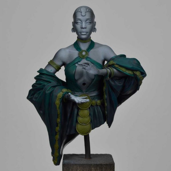
FIRST LIGHTS
Let’s go with the first lights of the fabric. First I add some white to the Pthalo Green(K) to increase the light value but without burning the color, always compensating and adjusting with Pthalo Turquoise(G). In the drawing I try to generate planes and volumes, shapes that will be the lighter reflections of the silky finish of the fabric. I try to generate lights in the areas where the light hits more dramatically, respecting the strong contrast characteristic of the fabric material.
I outline the shadow areas of the fabric with a mixture of black, phtalo green and blue(G) and I vary some tones by adding the Golden´s violet and turquoise. Using the colors of Golden´s acrylics allows me to enhance a little more the saturation but above all to reduce the matte finish of the Kimera paints.
THE FABRICS
Painting a fabric is always a delicate and laborious job. If we are looking to generate a specific texture we have to work not only the contrast, the lights, the shadows and the ability to reflect the colors around the material, but also the volume and texture. In this case, a silky fabric has many added difficulties, in a way it is the most complex of all possible fabrics, but also the most fun and stimulating.
Once the first lights have been painted, the initial sketch, we must continue to insist. The first sketch is usually simpler but also freer and more intuitive. You have to find the volumes, you have to bring out the forms, but it is not always going to come out the first time. As I advance in the drawing, I will refine, expand and correct the initial work. To do this I am combining highlights by adding white to the mixture of Pthalo Green and Pthalo Turquoise(G). This work is in highlights and mid-tone but for the shadows I will add blue and a bit of black. Also in the areas close to the skin I can slightly vary the mix with some violet touches.
Smoothing and blending transitions is an arduous and laborious task but it is worth it at the end of the process. For this I combine soft and translucent strokes, dragging the patina to generate a soft trace, but I also fill and stipple in some areas.
Before continuing to work on the fabrics, I recover the drawing of the lights in the golden areas to balance the opposition and contrast of materials. It does not require a drawing or a detailed work but rather playing with colour stains. As you can see, adding a little bit of yellow and white to the base, and with a little green to maintain the general atmosphere of the light, I define the volumes of the round areas of the dress and the belt plates.

On the other hand, I also work the sketch on the skin, for the same reason as the metals but with a little more work. I will explain this process in detail in the skin section.
After this sketch I return to the fabric and begin to focus on the reflections of the fabric itself. These reflections usually happen in the shadow plane, as a rebound of the light planes. It does not happen everywhere, but if you stop to study real references of these materials, it is clear how they are produced. It is also important how they work, and that is that the green is usually a little more vivid, it is not as desaturated as the main light.To get this, I add a bit of yellow and Kiwi Brown (K) to change the tone of the green, using the same colors as in the metals, to maintain the harmony, very important in the esthetics that I am looking for the figure.

Then I continue the fade work, softening the transitions with intermediate values. It is important to work with gray colors to adjust the saturation of the green both in shadow and light, and combining it with the bluish tones in shadow.
I also draw a series of deep strokes in the darker wrinkles, with a mix of Golden´s acrylics blue and turquoise, and a bit of black. I choose the more satin colors to give me extra depth in contrast.
I continue to work the highlights by stippling, bringing out some strong highlights in the raised areas of the arm. The lights have a sense of more or less realistic effect, but also a compositional and aesthetic intention. These three aspects must be considered when making a creative decision. Above the left sleeve the light plane should receive a little more light so I widen the space where the light value is higher to better explain the volume.


In the following steps I am going to take the fabric to the point of definition that I desire, using the airbrush to unify planes of light and shadow, and to maintain a dramatic focus in the central area of the figure. On the back side I draw stronger lights in the center trying not to kill too much of the green tone. In case this happens, which on the other hand is usually recurrent when we abuse of white at the time of raising the light value, it is necessary to correct with glazes, either with airbrush or brush. This process is always bidirectional, this way I make sure that at no time I burn the color or lose the medium tone.
GOLDEN IN NMM
At the same time of the work on the fabrics, I draw the gilding to mark the reference in relation to the main light source and the light source of the OSL. The orb emits a very intense light that will be reflected on the hands mainly but also on the fabrics and adjacent materials, and especially the metals. It is better to represent this effect clearly and exaggerate it a little in the first phase of the process.
To paint the golden parts I use the mentioned base of greenish ochre and add white and yellow, adjusting the saturation with more green and some black. The color work is important but the brushstroke is also important. When painting the plates, this brushstroke can be seen as irregular spots and stains, trying to focus on the upper area corresponding to the zenithal light. It is important to consider the curved shape of the medallions looking for the transition to enhance the feeling of the curve. The stains contain a certain amount of paint, trying to cover them well and make good use of the pigment.
In the shadow area we generate a small bounce reflection. In this first approach the bounce I draw it as a crescent of slightly greenish tone although later I would adjust it to a more neutral tone. The greenish bounce makes sense because of a focus of light coming from the environment and from the fabric although it should not be so powerful except if the plates were totally polished.
Once the first lights are marked, outline the shadows of each and every one of the plates with a mixture of turquoise, black and a little red oxide. It is important that it is dark enough to force the contrast and delimit the material between the fabric and also in the metallic shadow planes. I also draw the outline of the medallions with fine lines to outline the light with a medium tone of ocher less saturated to yellow so that it does not stand out above and take away tone. In the areas of reflection I incorporate a little orange, and add filters with chestnut ink. Finally, I mark a few points of light as a glow in the most prominent areas, trying to force the sensation of metallic texture.

I soften the transitions with dots and glazes to maintain a certain grain in the texture but also a soft finish. In the fade work it is common to lose some tonality when we abuse the white in the intermediate mixtures. For this I use inks as a diluted glaze to recover the loss of intensity and reinforce the tonal richness.

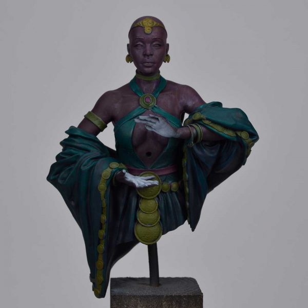
THE SKIN
Painting a black skin is also a very stimulating exercise since we are less used to working with this type of skin, and the tonalities and richness they hide are frankly precious. The contrasts are much stronger and more evident, and in that sense it is very important to take risks to achieve a realistic effect.
In the first step I recover the base color of magenta and green and add much more red oxide and white, adjusting slightly with primaries (yellow and magenta to maintain an orange tone). The base has a rather purple tendency, the light goes up towards orange and finally we kill the saturation with white. It is complicated to explain the exact shade or mixture, so my description is just indicative. For the painter following this guide it may be useful to explore realistic references in photography or other illustrations, and find your particular shade.
I make a first drawing of volumes, something like a mapping that defines for me the most dominant features in both the face and the body. This work allows me to understand the shapes of the figure and follow according to them all the refining work. During the process I adjust the tones and shades following the violet-red-orange-white pattern, trying not to burn too much any of the levels. If I go too far I will correct with glazes based on inks: chestnut, violet and some magenta for medium tones.
I add some more red oxide/yellow, to generate some orange tone and some white to increase the light value.I build the volumes on the face according to the shape based on dots, lines or stripes, to help emphasize that area. Some lights are generated in wide planes, but others in folds or bone protrusions such as in the trachea, shoulders or in the tear troughs on the side of the nose. It is necessary to recognize this type of volumes and draw them to give realism and veracity to the interpretation. It is important to note that this interpretation of the volumes responds to the proposal of frontal light slightly zenithal so if I worked with a different focus the result would also change. Finally, I give the lips a touch of colour by adding a little more magenta to get a more reddish tone.
I slightly recover a medium tone to soften the transition between the first highlights and the base skin tone. These medium tones contain a little more color saturation than light value, i.e. we must force with the magenta/orange tone instead of enhancing the yellow/white.
In the hair part, I work with a mixture of magenta green and white, to give a certain grayish tone to the hair and I work it by stippling. In the front light areas I add some orange to give more luminosity without forcing the warm tone too much, so I keep adding white in higher proportion. On the sides of the face I also work with a cooler tone of light to help frame the face and draw a view of light on both sides.

I continue to work the skin volumes on the face. I extend the plane of light on the forehead and around the eyes to the cheekbones, working with dots and also with stripes. Dots in general are quite easy to handle for working these kinds of small areas with a lot of detail. They allow me to simulate the pore of the skin and to draw controlled transitions. I define a little more the features of the face, marking the eyebrows with some black and the light spot of the eyes.
I recover some stronger glows by adding a little more white to the skin mixture to burn a series of glows that help me to focus the most outstanding areas. As in the rest of the process I don’t worry about blending the parts but I place the light spots and leave the integration process for the final phase. As you can see, the areas such as the nose, forehead, and the more angular bones such as the clavicle or shoulders receive the light hits more directly.
The main doubt when painting a face is how to integrate and work the lateral planes, and how they are integrated with the frontal view. In this image you can see the work done to draw the side around the jaw, the cheekbone and the temporal bone of the head. I raise the value but I remove magenta and red oxide so that the tone is not so warm orange and contrast with the light source, I also generate a shadow drawing under the cheekbone and the depression in the bone behind the eye. To do this I add a dot of black and violet ink to the base mixture. The ink is important to add depth to that shadow. In fact, I take advantage of this blend to mark the shadow plane under the eyes, under the jawline and under the ear, much deeper shadow areas.
Below you can see how I have advanced in the process of blending the skin, which causes me to lose a certain level of contrast and therefore forces me to burn the color in a series of highlights again. You can also see how the noise of the brushstrokes has diminished notably but maintains a certain grain and texture characteristic of the skin. With insistence and method we managed to achieve the texture correctly.
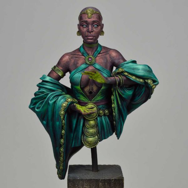
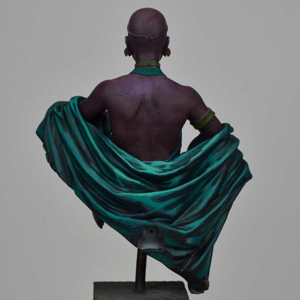
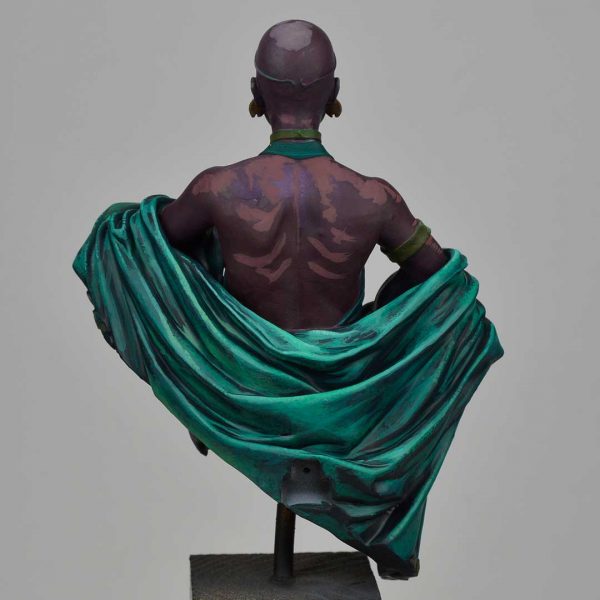
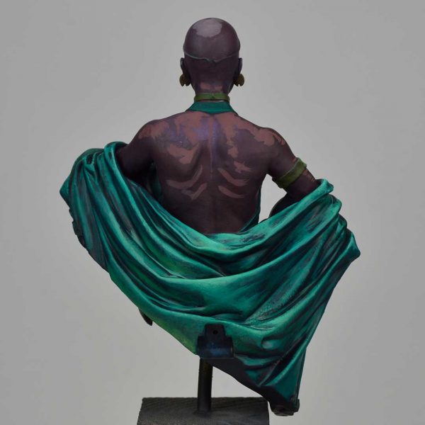
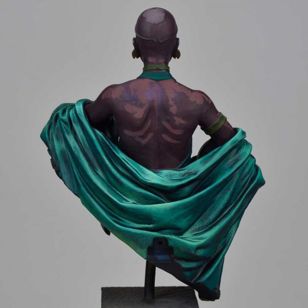
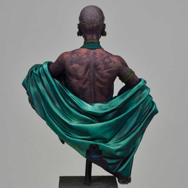
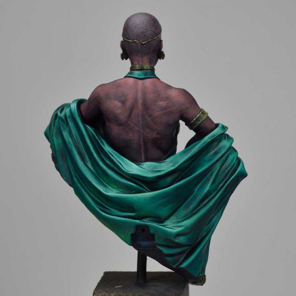
REAR VIEW
The back view is hidden in the final photo, once assembled on the support, but it is a very interesting area where you can see the drawing and definition process. It is also an area where you can see the fade work as the steps progress, both on the skin and on the fabric.
The fabric part as well as the front view is complex in terms of folds, so you have to generate a sketch to guide and facilitate the work. I draw lines with the same mixture as the front view, drawing volumes in parts like the center where a flat surface is intuited. In the first approach I do it roughly, and as I advance I will reduce the contrast.

Once the lights are clear in the main wrinkles I accentuate a zone of stronger light in the center where the light is supposed to hit more directly.
I do a fade job between the base and the drawn lights. To do this, I mix the color of the light and the base looking for a color with an intermediate value/lightness, and I add an extra green to saturate these intermediate lights and not lose the intensity of the color. I work with translucent layers dragging the paint with the brush. I try to respect the drawing of lights and what I do is to cover the intermediate space of the dark areas that I had not covered with the first light.
I also make a sketch on the skin, marking the forms that I can intuit of musculature and also the bones of the scapula and the ribs.
I add some yellow ochre to the mix to make some bounces as I did in the main view and slightly stipple some lights.
I work again some stronger highlights not only in the vertical line but also in the sides from the arms area.
I mark some stronger and deeper shadows in the hidden areas of the fabric and separate contrast one plane from the other. I add some blue to the base mix using Kimera and the aerocolor ink. If I lose the green tone I recover it by adding a little more.
At the same time I work a little more on the skin sketch, loosely tracing more mid tones and strong lights. The volume is intuited much better and that noise pattern is perfect as a starting point to generate texture and personality in the back. Some looser shapes allow me to intuit marks like scars that I will keep as if they were whip marks. In this sketching process it is common to find spontaneous proposals, the result of loose strokes and free approach that sometimes one finds interesting and worth preserving.
A new step of fading between the different stains, using intermediate tones and reinforcing the extremes to keep an eye on the contrast.
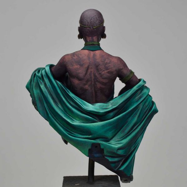
I work the details of the neck, bracelet and head to finish integrating all the parts. Unlike the main view, in this case I cool the last lights, adding some blue to the mix so that it is understood as a less illuminated area than the front.
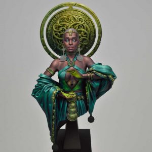
ORNAMENTAL CIRCLE AT THE BACK
The golden circle serves as a fantastic setting for the piece and it is important to work it so that it does not stand out above the main plane but functions as a reinforcement. The work is the same as in the badges and jewels of the bust, but slightly forcing a shadow plane to raise the light in the upper area and not saturate just behind the face.
First of all, I propose the scheme of light and shadow zones using ochre+green in proportions from less to more ochre depending on the area of light. I add a little yellow to vary the tone to the desired saturation point, and the same with the green, to which I also add some blue.
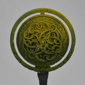
I give a kind of wash and outline, using shades of blue, turquoise green and adding some orange in the shadows of the light plane. The intention in this step is to bring out the contrast through the shadows so it is simply a matter of looking for the most hidden areas and playing with gouache paint. For this exercise I normally apply the dense paint in some points and the watered down brush to move the paint and generate contrasts by accumulation and density.
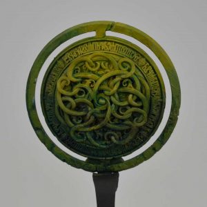
I recover the base of the lighter areas and add an extra point of white and yellow to increase the value and luminosity by saturation. From this point I outline the edges,and seeking the contour of the ornamentations looking for the contrast in the opposite direction to the previous step. I use the edge of the brush to be able to paint the contour and edges more accurately.
I draw a series of stains trying to texturize the larger planes, especially the areas with less detailed ornamentation. I try to make my brushstrokes varied to give the sensation of randomness in the texture. In this way I combine sharp strokes with other more irregular ones to generate the perception of various damages in the surface.
I do the same exercise but in this case simply looking for the strongest and most prominent edges, selecting them to give a point of light practically with white and a touch of yellow to increase brightness and keep the tone.

Finally I finish all the details, polishing in general the effect described in the previous steps and adding an extra point of tonal richness with glazes and washes of blue, turquoise and chestnut inks according to the areas of shade, medium tone and light. I also accentuate the oxide effect with a mixture of white and turquoise looking to generate an oxidation effect in the lower areas based on gouaches and stippling.
BRIGHT ORB
The final touch to the figure is the magic orb, a focal element within the main view but which I decided to leave for the end to play with saturation and light. Rashida’s hands I had worked them in light yellowish green, mixing white, yellow ink and a tip of the phtalo green present in the rest of the piece.
In the two views you can see the light effect on the hands as well as the initial drawing on the fabric that is hidden in the belly. Also a small reflection in the area of the skin that in the final assembled version is completely hidden.
I propose a stronger stroke of saturation in that area lightening with white and then correcting with the brush with the most powerful and saturated tone. The contrast of saturation helps to make the effect more powerful.
Once the environment has been created, I paint the orb with a base of white using the brush and airbrush, and then I give a base of the same tone of greenish yellow using the airbrush. I take advantage of the lighter base to exploit the potential of color.
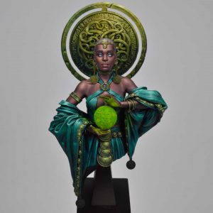
Then I paint the ornamented areas with a mixture of the base with more white and yellow to get a lighter and brighter light value simulating the interior light. In the following steps I adjust and integrate the effect until the desired result is achieved.
FINAL FINISHES
Once the orb is raised, I glue the earrings and coins hanging from the fabric and work them with the same mixture of golds trying to integrate them correctly with the environment.
With all parts assembled on the piece I work the final details, polishing and adjusting levels and brightness. In this last point of my painting process, I like to work with filter-based airbrush to unify the shadow tones and medium tones, and finish off those small parts where the fade work does not work perfectly or where I seek to boost more color notes that give richness to the set.
The glows and brush finishes are also important, as they allow me to adjust the centers of attention with the set, they are accents and final exclamations to give more visibility to the points that I want to highlight.
